Showing posts with label review. Show all posts

REVIEW: Varujan Boghosian and Erick Hufschmid at BigTown Gallery in Rochester


A Summer Afternoon with Collages and a Photographic Studio Visit at the BigTown Gallery in Rochester

by Dian Parker

Henry James said, "The two most beautiful words in the English language -- summer afternoon."

It was a perfect late summer afternoon. The bees were buzzing in the lush flowers in the front of the gallery; inside people buzzed in front of intriguing art; out back the BigTown Big Tent outdoor amphitheater was abuzz as technicians prepared for the first starlight show of the summer. Summer in Vermont is a wonderful time to see creativity, especially where it is well tended by Anni Mackay, who, as usual, brought together a delightful mix of artists to fill your mind and heart with the creative spirit.

Currently in the gallery are two artists, octogenarian collagist Varujan Boghosian and the anthropologist-like photographer, Erick Hufschmid. It is an ingenious pairing.

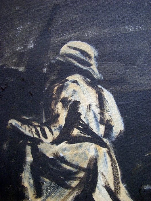
Hufschmid photographed the busy studio where Boghosian creates his collages. These photos are mysterious; the colors rich. A tumble of wooden tops in blue and red. A large carved stone head hovers over a tiny red ball. An old upside down green baseball game. A ticket stub; tiny leather Chinese slippers. All these and more are a hodgepodge of disparate objects, which Boghosian uses in his collages. The photographer uses only natural light and often succeeds in making the tiny appear large, like the pearl tipped sewing pins beside a yellow metal truck. All the archival pigment prints are framed, but one can also purchase the prints unframed or as a set in a beautiful handcrafted leather bound portfolio (made in Bogota, Colombia) set in a cloth box. Hufschmid told me he had to sit in Boghosian's studio for many hours before he could even begin to know what to photograph, it was so dense with interesting objects. He pared down his 1000 photographs of the studio into 18. He chose not to move anything, making use of three cameras, zooming into the objects so that often you aren't sure what you're seeing, which makes for an interesting study.

To create his collages, Boghosian selects from the objects in his studio and combines them to form stories of his making. Maker of the Beautiful was inspired by a short story by Hawthorn (it is also Boghosian's self portrait). Cygnus is a star map with a swan and old paper poker chips. Another collage, Homage to Stanley Kunitz, uses the backside of an old Paris map. There is faded wall paper and hand inked music scores he collects, as well as a paper ledger from the 1600's he found in Italy. The titles alone give you the flavor of his collages: Gauguin Leaves Tahiti, Tears of the Mandarin, Trophy (for Elisabeth Bishop) based on her beautiful poem The Fish.

After enjoying the exhibit we made our way outside and around behind the gallery for a picnic, followed by one of the most remarkable dance performances I have ever seen. The Bridgman/Packer Dance is a couple who have been dancing together since 1978. Their current show is a gorgeous pairing of live dance with video technology. The couple dances in front or behind the screen and often you can't tell which is the real couple and which is the film. Breathtaking.

On a summer afternoon while you're wondering where to stroll, try a jaunt over to the gallery at BigTown. Stroll through two artists' creations. Take in a performance at the BigTown Big Tent in the evening. You too might share the sentiment with our Henry James, that not so perfect but all too splendid gentleman.

This review was first published in the Randolph Herald

Images (photos by Dian Parker): Erick Hufschmid, Untitled, 19.38” x 19.44”, archival pigment print Varujan Boghosian, Gauguin Leaves Tahiti, 23” x 22.25” x 2.75”, construction

REVIEW: Art in the Park in North Bennington


14th Annual North Bennington Art in the Park Show
Part One: The Sculpture

by Bret Chenkin

On July 14th, the annual North Bennington Art Show opened with much fanfare as a funky band jammed on the McGovern Masonry green and dozens of art goers strolled around viewing work. The picturesque Victorian train station once again hosted over a dozen paintings in the Train Station Gallery, curated by Jillian Casey of the Forum Gallery.

The line-up of outdoor works, as arranged by Fred X. Brownstein, reflected the democratic tradition of this annual exhibit – ranging from established artists to the "professional by day, artist by night" practitioner. The overall sculptural tone and material presence appeared to tap into the waning nature of our times: scrap metal, rusty steel, and rough wood abounds.

The general hue is subdued, almost melancholic (not much in the way of primary colors), yet a few more traditional pieces, in bronze and stone, grace the lawn here and there. The voluminous amount of objects certainly indicates much sublimation is occurring in the area. All this “sound and fury” also shows that many people are laboring on various metaphorical and formalist problems in art, and that the tremendous pleasure in wrestling with those problems – even in these fractured, media-saturated times – has not waned.

With over thirty (mostly large) objects to deploy, Brownstein did a nice job finding the appropriate space for each work. Colorful pieces were near greenery-while smaller pieces (such as Peter Lundberg's cast iron scholar rocks) were given more area for proper contemplation. The utter variety was taken into consideration too, so that a formal work was juxtaposed with a really conceptual or abstract piece – to the benefit of both – most of the time. Sometimes the works that were comprised of found objects or less 'appealing' material got lost in these informal settings, but if compositionally strong, their equilibrium eventually recovered. Inversely, pieces that traditionally function best in such settings (on lawns, greens, beside buildings) seemed contrived when in the presence of less pretentious fare. All in all, this disparate work scattered about the streetscape is visually engaging.

When scanning the lay of the land, rust and dilapidated wood appeared to be le mode du jour. This may have as much to do with people's penchant for recycling, as it does the convenience of found objects. But the many allusions to end times may also be informing this weary aesthetic. For example: Michael Biddy's tragi-comical Death of the Dollar, displays a large wooden dollar sign laid upon a funeral bier; or Patrick Healey Labor is like some tired wooden monument to the futility of energy expenditure; while Stephan’s Seasweep, with its confluence of refuse, may be both an elegy to the dying seas and a clever poaching of postmodern art (such as the work of Stockholder, Murray, and Kelley).

Other works in this more contemplative vein are Zac Ward's Figure in a Boat, with a configuration of choppy lines in wood and steel clamps, and a harshly rendered seeker (in a proto-Cubist style) navigating uneasily upon the thrusting vertical plinth; and Stephen Anisman's Citadel , a glossy red pyramidal mini-monument of steel dowels tilted from the ground.

Londa Weisman really wowed with Out There, a hefty Caligariesque home of rusted steel plates, in which the interior implodes upwards and inwards almost three feet, to a diminutive square window, this teasing geometric play on light providing a mystical escape.

Fred Brownstein, Mason Hurley and Andrew Devries made it clear that the mythic, and the Biblical, still influence art today: Brownstein's Ulysses Heads for Trouble, rendered near-perfectly in marble, speaks of the dichotomy between the modern and the classical: the siren is carved as a headless Grecian nude, while Ulysses is a hero of organic bulges. Hurley's Hephasetus appears to be the lame god's forge, or maybe the famous net he created, while DeVries with a double billing melodramatically interprets Adam's fall from Eden and creates a cold, domineering Venus, both in bronze and more than life-sized.

Not to say that all was grim or grave, for color came in the form of Willard Boepple's yellow curvaceous abstract line drawing of painted wood, connected in a tense counterpoint arrangement and also Michelle Vara's 3-D doodle (like a drawing taking a walk) in a matte brick red. Outright humor and whimsy is present in Gary Humphrey's giant musical sculpture, the aptly titled More Cow Bells constructed of rusty metal; Matthew Perry's two concrete block figures by the station, a man and woman, suburbanites who are waiting for the train; Leif Johnson's "Garden Chair" of slate and steel; and Andrew Dunhill's "Twinkle Toes", which conjures a dancer in space in the form of huge metal tubing, resembling in some ways a giant's gastrointestinal tract. Joe Chirchirillo's water tower of concrete and steel, and John Umphlett's Primrose Bronze, which features a bronze flattened blazer and a trough of fine sand with an aluminum rake, add to the variety of this enormous showing.

Images:
Forrest MacGregor, Getting There, Wood and Steel
Bill Botzow, Willow, Wood and bark
Andrew Dunnill, Twinkle Toes, Steel
Patrick Healy, Labor, Wood and steel
Fred X Brownstein., Ulysses heads for trouble, Marble
Matthew Perry, Man still waiting for the train and Woman waiting for the Train, Mixed media
Londa Weisman, Out There, Steel

REVIEW: William Ramage at Gallery-in-the-Field in Brandon

William Ramage’s exhibit is only up through June 30, so hurry if you want to see it! – Ed.

By Liza Myers

William Ramage's current exhibition, The Men's Group explores human perception: how we actually see the world in which we live. In an impressive, large-scale installation, Ramage challenges the rules of linear perspective that have governed artists since the 15th century. He asks us to view the world centripetally. The term refers to drawing into a visual core, into a center, rather than viewing the world linearly, along the traditional lines into a vanishing point.

The space is dominated by a monumental installation, an embracing circle featuring two immense, free-standing arcs of photographs. Simultaneous realities are juxtaposed. The images boggle your sense of reality and space, setting your equilibrium askew.

Additionally, as you walk behind the installation, the gallery walls are hung with the actual stunning, large-scale drawings featured in the photographs. The drawings are a visual feast and impressive body of work unto themselves.

To the uninformed the installation is fascinating, but initially seems odd- slices of imagery adjacent to one another confound the viewer. How can the same grouping of men be standing next to each other in adjacent locations, seemingly at the same time? Who are they, why are they gathered?

The intellectual underpinnings of Ramage's work are deep and complex. In his new book, Seeing, available at Gallery in-the-Field, Ramage quotes Blake, Huxley, Proust, Emerson and more. The philosophical breadth is vast. Within the pages of the book Ramage's artistic thought processes are clarified.

Artists who ask us to see differently challenge our sense of reality. They ask us to step beyond the status quo, beyond confining perceptual limitations. Contemporary visionaries such as Goldsworthy, Turrell, Banksey, and JR ask us to see new possibilities, thus nudging the human race farther along our path, wherever it might lead. Joining an impressive group, William Ramage's exhibition will expand your sense of what is possible.

Gallery in-the-Field is at 685 Arnold District Road (just off Route 7) in Brandon, VT. Hours are Friday - Sunday 12-5 pm and by appointment 802-247-0145

REVIEW: 50 Area Artists on Display at the Chandler Gallery in Randolph

by Dian Parker

Every spring the Chandler Gallery offers an opportunity for area artists to exhibit their work. This year 50 artists display more than 140 pieces of their art in the expanded gallery. You’d think it would be impossible to show that many pieces without the gallery feeling crowded, a mish-mash of art. Instead the show is a wonderful surprise. Not only is the show pleasing as a whole, there are also many different genres of art displayed. To consider each of the artists is not possible so I have selected only a few.

Two landscape artists, Kathleen Fiske and Katherine Ravenhorst-Adams, have 3 paintings each in the show and they alone would be worth the visit. Fiske’s Swimming Hole on Locust Creek, oil, is striking with its meandering stream with sunlight splashing across the water, and when seen from a distance takes on new dimension. Ravenhorst-Adams’ Wet Meadow, oil, with its luminescent wildflowers dotting a lush green field, is well done and luscious.

Bob Eddy’s Tsunami Nuclear, acrylic on linen, is a painting after the great ukiyo-e (“pictures of the floating world”) artist, Hiroshige, whose painting of the blue wave with mountains is famous. Looking closely at Eddy’s painting you can just make out his alteration: the crippled Fukushima nuclear power plant on the distant shore, burning, with no birds in the sky. This would make a striking New Yorker cover.

Sally Penrod’s gouache, Rust to Dust, is a delightful composite of 6 views of an old rusted Citroën in the woods. Tamara Wight’s woven basket with embedded driftwood, From the Marsh, looks like one of Dale Chihuly’s glass seaforms. So does the huge carved ash burl Peace Be With You by Jim Ludwig, where you can see the knots and rings of the great tree. And at such a reasonable price!

John Parker’s assemblages are created using old painted wood. The Blues, – blue wood with an old wooden Borax cover and My Little Piece of Earth, an old metal tool sticking through a wooden framework and a child’s block at the end with a painting of a miniature house – are both whimsical and elegant.

Intriguing 3D maps of Vermont and New Hampshire in wood by Norman Kinzre contain the precise details of a topographical map. I have no idea how he managed to do them. Norma Wasko’s photographs are rich in light and complex detail. Kitty O’Hara, Lost Pond, with copper and gold reflections, is serene yet vibrant (she should stick to landscapes). Michael Williams deftly made two large farm tables out of maple and spruce. There is a wonderful oil pastel, San Juan Island, by Jane Cathey and a lovely watercolor Woodstock, Vt by Marcia Hammond, with splashes of color along a country road. Jan Fowler’s beautiful Red Barn deserves a better frame. Jim Robinson’s 2 photographs, Tulip Curves and the inside of Orange-Purple Tulip are gorgeous. I loved Helen Hesslop’s three photographs, especially Masai Settlement from the Air, which looked like a delicate pale abstract painting.

Tim Clifford’s The Rainbow, in oil, is poetry with the still quiet of a farm after a rain storm and cows lying down in the field. (Is it really true that cows lie down before the rains come?) Christopher Kerr-Ayer’s delicate glass sculptures of polar bears and giraffes are adorable (and at a tempting price). The watercolor by JoAnn DiNicola Surrounded by Autumn Gold II with a proud old rusty car in the forest makes you curious about its history. Lou DiNicola’s photo, Orange shoes on Beach with the two shoes left behind as if the person walked away on the water leaving no footprints, is provocative.

There’s the bronze sculpture Music in the Reeds by Bonnie Willett, a swirl of sleek elegance, and Frank Gardiner’s Sitting, a wonderful Degas-like gouache on paper. Connie Thurston offers fine details in colored pencil, like the fur of her Cougar, that nearly jumps out of the frame. Tom Batey’s Solar Max, a large hanging sculpture made with metal, wood and glass, depicts the dangers of our sun with painted nail heads as the star above and charred wood of the burning earth below.

This is only a fraction of the artists displayed. The show has a large range of talent and expertise. The prices also show diversity, ranging from $35 to $4000. Go and see for yourself and pick out your favorites. You’ll be surprised at what inspires artists in our region. The show runs til July 10.

This review (without Dian Parker's photos) first appeared in the Randolph Herald on June 9, 2011.


Images (top to bottom):
Kathleen Fiske, Swimming Hole on Locust Creek
Tamara Wight, From the Marsh
John F. Parker, My Little Piece of Earth, mixed wood and metal
Tom Batey, Solar Max, mixed media; wood, metal, glass

CHANGES: New Gallery in Randolph


The Korongo Gallery Opens in Randolph

by Dian Parker

Living in the East Village in Manhattan in the late 60's and all through the 70's, I’d often hang out with artists at a street café and we’d talk about our work incessantly. Bongo drummers lined 2nd Ave and the small alcove of my eight-floor walk up was often a place for bums to sleep. Artists opened their apartments as tiny makeshift art galleries. On one wall hung a tie dyed sheet and on the floor a double mattress. Not much else except art. And more art. It was everywhere, some of it not very good, but it was an outpouring nonetheless; a place to be seen. We never thought the East Village would become what it is now, one of the hip places to live in Manhattan, still filled with art, only much more expensive.

Along comes the Korongo Gallery to Randolph and we have promise again of a beginning that could very well burgeon into something hip and wonderful – a place for artists and writers to display and read their work, congregate and hang out. At the opening on March 17 there was a feeling of excitement and expectation that we might just be on the verge of a new happening, right here in downtown Randolph. The gallery was packed. Patrick Texier, the owner, schmoozed with the folks and Laurie Sverdlove Goldman, the painter, talked about her work which hung on three of the walls. Jack Rowell took photographs and everyone was smiling and milling about. The food was delicious. This was a real opening in a new little gallery that has a big and bright future.

Texier was born in France and spent his early childhood in the artists’ colony of Les Baux in Provence, where his next-door neighbors were the renowned engraver Louis Jou and the Belgian sculptor Adrien Mertens. His grandfather was an American painter and his grandmother was an artist’s model, who met in Paris in the Twenties. As Patrick tells it, "I wanted to be a painter, but my father said it wasn’t an option, so I became a safari guide in Africa instead." He’s now also published two of his illustrated children’s books, for sale in the gallery, inspired by living close to wild animals in Africa.

The inaugural show at the Korongo Gallery is Battlefields: WWI, the work of California landscape artist Laurie Sverdlove Goldman, who moved to Randolph from the Bay Area three years ago. Describing this body of work Goldman says, "I became interested in war landscapes as an outgrowth of my interest in other manmade landscapes. Explosions, mud, barbed wire, grass, sky, death – the conundrum that terrible and terrifying things can be beautiful." In the current show are two large composite paintings, oil on canvas, each composed of eighteen or nineteen 10" x 12" smaller paintings shown in a grid, either with off-white or black backgrounds, Soldiers in Trenches/Black and Soldiers in Trenches/White. These are accompanied by two 34" x 46" pastels of explosions, Battlefield 1 and Battlefield 4, elegant blasts of color in subtle shades of pink and blue, yellow and green, and they ARE beautiful. Goldman’s work has been widely exhibited in San Francisco, L.A. and San Diego and is included in many corporate and civic collections.

Besides showing art, the gallery’s other business is to layout, design and print books in small quantities for authors who would like to self publish (no editing however). Patrick and his wife, Sara Tucker, will also use the gallery for events such as receptions, readings, writing workshops, story-telling, and informal discussions.

Across the street from the gallery is the new restaurant, Black Krim, which will coordinate some of its events with Korongo. Imagine a glass of wine in one hand, a Nori sushi in the other, listening to a writer read from her new novel or an artist talk about his work, surrounded by art on the walls while Edith Piaf sings softly in the background. A bit of Europe, a bit of New York City, and every bit itself. It can happen, but we must frequent the gallery and come to the events. Korongo is a happening place if we make it so.

The next exhibit will open on April 29 and feature cartoons, stained glass, and sculptures by artist Phil Godenschwager. It will also include Jack Rowell’s photographs of Godenschwager’s work.

Gallery hours – Tues-Sat, 11 am – 7 pm
18 Merchant’s Row
802.728.6788

Images by Laurie Sverdlove Goldman:
Soldiers in Trenches - White/ series, oil on canvas, 12" x
10"
Soldiers in Trenches - Black/ series, oil on canvas,
12" x 10"

REVIEW: Fran Bull at Christine Price Gallery in Castleton


“In Flanders Fields the poppies blow

Between the crosses row on row,
That mark our place; and in the sky
The larks, still bravely singing, fly
Scarce heard amid the guns below”
- In Flander’s Fields
- John McCrea

By Liza Myers

Fran Bull’s epic installation In Flanders Fields: a meditation on War is an experience not to be missed. The scale alone is extraordinary, particularly because it is offered to us as a single, monumental artwork rather than a collection of individual pieces. The viewer enters fully in, treading upon the shadows of the floating birds above, walking between silent, haunting figures. The steadfast, blank gaze of soldiers who perished in the tragic battles of WWI interlace across the gallery with the mournful, accusatory stares of the women of Lysistrata, creating a piercing gauntlet of sorrow.

Entering the softly-lit gallery space, the viewer is immersed in an elegant visual and intellectual exploration. Ms. Bull refers to the work as her “silent scream in response to all war,” powerfully addressing the tragedy of man’s inhumanity to man over a two thousand year span.

The exhibition draws a line of human connection from Aristophanes’ Lysistrata to the renowned poem by WWI soldier and Field Surgeon John McCrea from which Ms. Bull takes the title of the show. In Lysistrata, Aristophanes’ comedy from 411 BC, the women of all Greek city-states withhold sex from their soldier spouses until the men sign a treaty of peace. While humorous, the play is about the Peloponnesian War, a horrendous, brutal 27-year battle between Sparta and Athens. In Flanders Fields, McCrea speaks to us from the battlefield, spattered by the tragedy of war, yet hearing bird song, seeing windblown petals.

Immediately upon entering the gallery space we are greeted by four larger-than-life white figures. Two elongated soldiers dangle in mid air. Are they ascending to heaven or falling, blasted out of their foxholes? Beneath them, two stately Greek women gesture awkwardly, bewildered, stunned, beseeching us to behold the tragedy, to stop.

While the work speaks to war, it is not visually gory or brutal. Ms. Bull’s color is stark, dramatic. Bloodless white figures and faces are interspersed with the intense red of gracefully drawn poppies. Black larks are elegantly printed on diaphanous, ghostly gauze. These symbolic colors are a relief. They offer balance and serenity: an austere abstraction which allows us to distance ourselves (slightly) from the horror of war. Here and there, the simple beauty of flowers or birds become a respite. A single, relatively comic, brightly-colored print depicts the faces of women interspersed with skillfully drawn birds.

The scale of Ms. Bull’s work is extraordinary. Twenty or more life-sized busts of the women of Greece mounted on simple, bare-wood pedestals, speak to us of ancient battles from groupings placed around the gallery. These sorrowful figures gaze upon 126 shrouded death masks: the faces of the dead from a more recent, 20th century war field. We observe them as if we are gazing down from above, floating with the flocks of abstracted bird forms that dangle in the air, casting eerie shadows on the walls and floor.

Bull states: “I have created an aesthetic and meditative environment in which viewers are led to contemplate the nature of War as it weaves through human history. My hope is that viewers will be inspired to examine afresh the paradigm of War as a response to conflict.”

Artistically, Ms. Bull fearlessly combines and experiments with media demonstrating an astonishing breadth of ability: innovative sculptural techniques and materials, traditional and experimental printmaking, lithography, painting and more. She generously explains her technical explorations in a didactic display tucked into an alcove.

And she invites us to participate. As the show progresses, more and more splotches of red paper punctuate the figures. Ms. Bull has provided small squares of poppy colored paper, asking viewers to write a comment and place it somewhere in the installation.

In Flanders Fields: a meditation on War, a touring installation by artist Fran Bull, will be on exhibit at the Christine Price Gallery at Castleton State College from February 28th through April 1, 2011.

Photographs by Don Ross

REVIEW: Lowell Snowdon Klock at the Brandon Artist Guild in Brandon


By Liza Myers

Manipulated Polaroids by Lowell Snowdon Klock

The Brandon Artist Guild is currently featuring an exhibition of Manipulated Polaroid images by photographer Lowell Snowdon Klock. The intimate size of these images compels the viewer to approach closely and examine the world through the photographer’s eye.

The images are diverse. Landscapes, interior scenes, pastoral settings, still lifes and motorized vehicles – trucks, trains, and antique cars are united by dynamic composition and saturated color. Delicate, slightly wavy diagonals inform us about light and shadow, venetian blinds, truck radiators.

In an era dominated by digital photos, Ms. Klock puts her SX-70 Polaroid Camera to good use. Invented in 1972, the camera features a unique, hermetically sealed packet of liquid photo-chemicals. This chemical soup produces a fixed photograph approximately one minute after exposure to light. Klock must work quickly to achieve the desired alteration. Using her fingers, a bone folder or other un-sharp object she presses and prods the emulsion, creating a painterly effect as the emulsion squishes within the packet.

Klock states: “Delineation is diffused and often expresses more of a feeling rather than structured composition. One has no idea where this will go and where to start. This mystery is what makes the process so enjoyable and addicting.”

While the viewer might anticipate a smeared mess, the delicate effects accomplished in this process are quite lovely. Klock’s manipulations are deft and intentional, resulting in a finely detailed, almost watercolor effect, transforming the literal into a magical, new reality.

Artists such as Lucas Samara seized upon this new technology in the mid-70’s, developing methods to alter the emulsion and distort the image, enhancing it in the process. Klock follows in this tradition. It is important to note that without a finely composed photograph as a starting point these manipulated images might be gimmicky. But this is not just about technique. Klock’s skillful photographer’s eye captures dynamic compositions in everyday images: vegetables on the kitchen counter, the brightly lit radiator of an old truck, a beckoning pair of Adirondack chairs. Klock's eye discovers subtle visual relationships in pattern and color. In MG Grill, the almost zebra-like pattern of the metallic radiator grille is punctuated by spherical forms which reveal themselves as multiple reflective headlights. In Coffee Exchange, the ribbon-like ripples in a simple water bottle echo the linear shadows of a venetian blind.

This show is definitely worth a slow perusal. It will be on display at the Brandon Artists Guild at 7 Center Street (Rte 7) in Brandon, VT until April 30.

Hours are 10-5 daily. Phone: 802-247-4956 http://www.brandonartistsguild.org

Images: MG Grille, Coffee Exchange, Under the Umbrella, all Manipulated Polaroids

REVIEW: Jayn Bier and Chip Hopkins at Art Space in Tunbridge

By Dian Parker

A delightful show, Scrapwork, is at the Tunbridge Public Library’s Art Space, through April 16, 2011.

Jayn Bier and Chip Hopkins are two artists now showing in Tunbridge at Art Space;. They each use recycled materials and both artists’ work is full of whimsy and character, full of story and humor.

Jayn Bier makes folk art patchwork pictures using fabric scraps, yarn, and buttons, stitched and appliquéd. Her textile pictures capture scenes of country life; hunting for arrowheads in her grandfather’s backyard, a cat hunting amidst cattails, autumn in a chicken yard, a man playing a banjo on his porch, the empty slippers of her grandfather at his bedside, boys skating on ice. Each piece is sewn with a sure hand, uniquely mixing fabrics and colors to form not only the details of her images but also the borders and frames around each scene. Checks and plaids, felt and sleek material, black and white, orange and yellow - all her combinations are pleasing, drawing you into the story. One called “Late for the Game” shows a boy on ice skates running to join an ice hockey game in the distance. His ear flaps are raised, his elbow lifted and reaching, hockey stick in hand, one leg pressing his skate into the ice as he rushes to catch up; his body pumping with all his might. The perspective in the picture is wonderful, showing the other boys tiny in the distance, already at play. All the boys have left their shoes tucked under a wooden bench at the side of the ice. There is a shining sun made from a button with its rays of thread, warming the players. The ice is a glimmering fabric of subtle colors.

Beside each of her pictures is a card describing Bier’s related childhood memories; equally charming. For her “Free Range Morning” she wrote: “Inspired by early childhood memories of morning egg gathering with my grandfather. He, I and the hens shared delight in freedom and breakfast.”

“Baby Giraffe and Bird” is an adorable scene, to which her note adds: “Scraps of ‘climbing skins’ husband Bruce discarded after outfitting his back country skis are reborn as a new little giraffe.” The delicate piece has all the charm of a sweet baby animal. For “King of the Roost” Bier uses great color combinations of mustard, rust and yellow along with black and white plaid. All of her patchwork pictures are darling and well made. In her artist statement, Jayn Bier says her age-old technique was “inspired by the frugal simplicity of rural life and learned from the artist’s grandmother and great aunt.” How wonderful that she has chosen to continue this delightful folk art tradition.

Chip Hopkins’s art work includes scrap metal sculptures and oil paintings as well. His sculpture is filled with humor, often tongue in cheek. “Clown” is made up of a liner from a stove burner for the hat, fencing wire for hair, spring from a garage door (maybe) for the body. It evokes the playfulness and pathos of a real clown. “Troubadour” has bicycle handlebars for legs, pipe elbow for a torso and rebar for arms. “Punch” is a fanciful character with his bicycle pedal body that moves. “Devil” is the only piece that is entirely painted. It is bright orange and devilishly imaginative. Hopkins wrote: “Scrap metal sculptures is a metaphor for my life – having been broken and reassembled to being a functioning member of society.”

My favorite of his oil paintings are “OIL CHANGE – OIL PAINTING”. Here is a Prussian blue old Mercedes sitting in a stark white room. A man in overalls is lying underneath the car holding an oversized wrench. Hopkins put the painting in an ornate large gold frame and the juxtaposition of subject, the folksy rendering of the painting, along with this fancy, gilded frame is wonderful. Another of his oils is “COVERED BRIDGE”, reminiscent of the Taos Art Colony painter Marsden Hartley from the 1920's. Hopkins’ tangled blue tree, blue road (or water) running through the bridge, white clouds (or snow) are like Hartley’s monumental shapes that he used in his impressionist landscapes. Chip Hopkins’ choice of frames adds an extra dimension to his works especially the metal frame he made himself, surrounding his “SPACE MAN” painting.

This is a show worth seeing.

Images:
Jayn Bier, Baby Giraffe and Bird, textile using fabric scraps
Chip Hopkins, Oil Change - Oil Painting, oil painting

REVIEW: Marc Awodey at Dibden Center for the Arts at Johnson State College in Johnson


Painting the Ideal:
The Art of Marc Awodey

By Davis Koier

"I paint pictures- there's no overarching conceptual basis to what I do. I'm not versatile enough to paint any way other than how I paint."

So begins painter and part-time Johnson State College faculty member and alumnus Marc Awodey's artist's statement on the 40 acrylic and oil paintings that line the wall of the Dibden Center for the Arts.

"Awodey's clear-minded tactics have the ability to hold a viewer's attention and allow several relationships to mingle within a single canvas," said Dibden Director Leila Bandar in her curatorial notes on the exhibit.

The paintings focus on mood rather than technicalities. Human figures are intentionally ill defined with only smudges to indicate eyes, nose and mouth. Instead, Awodey uses rich colors and luxuriant textures to capture the viewer.

"Narrative content is the least interesting part of a painting to me," Awodey said. "The anatomy of the picture is always more important than the anatomy of the subject. My figures are usually gestural rather than specifically detailed. Lines and brushwork are also gestural rather than polished. Colors are layered and juxtaposed rather than directly blended."

One of the pieces that perfectly displays this focus on sensation rather than observation is "Meat Triptych," where great globs of luscious reds and browns are used to display hunk after glorious hunk of meat. The shapes of the meat are highly simplistic, in some cases resembling ovals more than ribs or loins, but the almost palpable textures Awodey's brush gives them, along with their warm colors, make the subject evident.

"These paintings record a dialogue between painter and paint. Each brush stroke represents a decision on the canvas," said Dibden Director Leila Bandar in her curatorial notes. "In each painting, there is clarity, decisiveness and the articulation of one, or more, visual concepts. Awodey's respect for art history and its lineage brings Modern Masters to mind such as Matisse, Van Gogh and Munch. Yet his themes, quirks, textures and layers of color make his paintings unique to our time… Resourcefulness trumps predictability over and over again."

Many of Awodey's paintings seem to be more concerned with concepts rather than subjects. He depicts Church Street as a simple, deserted road to a church lined with featureless buildings underneath a vivid blue sky. The details of shops and other people are unimportant, only the feeling of unhurried freedom. One is reminded of Plato's Theory of Forms- that is, that the objects that surround us are merely shadowy representation of higher concepts. Anyone can draw a road, but Awodey seems to capture thoughts and sentiments rather than their base appearances.

"I develop a dialogue with the canvas and let it develop on its own terms – I don't try to impose my will on the painting," said Awodey. "I have no idea what you may see in a painting, so I try not to worry about that, and don't ask you to look at anything in a particular way. When a painting is finished, my original intent is irrelevant."

After graduating with a Bachelors of Philosophy from Grand Valley State University, Awodey came to Johnson State College in 1981, and graduated in 1982 with a Bachelor of Fine Art degree as well as a Departmental Award in Studio Art. Awodey then went on to get his Master of Fine Arts degree in painting at Cranbrook Academy of Art in 1984.

Currently, Awodey teaches Drawing I at JSC, as well as painting at Burlington College. He is also a freelance art critic and has written several books of poetry. His show will run through Aug. 8, with an artist's talk and reception on March 8 at 3:30 p.m. in the Dibden gallery.

Images: Exhibit view, Shooting an Elk, Woman Knitting

REVIEW: Bill Long and Kaori Hamura at Gallery in the Woods in Brattleboro


The Art of Bill Long and Kaori Hamura

By Jamis Lott

Modern art has reached the point where the need for a new movement and style is long overdue. One particular style that is becoming more accepted in galleries and has gained popularity, especially with the younger crowds, is illustrative and “cartoony” compositions. A pair of artists that base their style in such arts is Bill Long and Kaori Hamura. Both work in animation, production design, web design, character design, poster and CD jacket design and, hopefully very soon, illustration for children’s books. Their styles also have no trouble being displayed in the gallery setting, as is evident from their work on display in Brattleboro’s Gallery in the Woods.

Over the numerous years that Bill Long has exhibited in Brattleboro, he has stayed faithful to the content of his work and has found no need for improvement. His paintings always have at least one occupant. One of Bill Long’s series consists of an array of fictional birds roosting and soaring, but the majority of his paintings feature a race of people colored in highly saturated purple or green. Lanky limbed and bulbous headed, these characters go about their lives- they boil violet crabs for dinner, peek out of bubbly baths, haul baskets of fruit, play guitar, and pause as though they are seeing what the viewer sees and are contemplating their own realities. These characters also seem to function as hosts for the viewers and invite us into the rest of the painting.

Always in one point perspective, the paintings take place in cupolas, barn lofts, birdhouses, and seaside restaurants. These abodes are detailed with props and furnishings that add hominess to each setting. An opening centered in the middle of each composition reveals a cutesy world beyond the room the viewer starts from. Through the window, porthole, or gap, the view expands into spacious sky, ocean, and countryside. Each painting gives off the sense of a world within that is as boundless as our own.

The scenes are soaked in high saturation and the chosen layout of colors results in an overdose of visual stimulation. Dark red hair flows down a girl’s light green skin, and a soft pink sky is the background for a cluster of trees with deep violet foliage. As these examples show, opposites in hue and value have no trouble sharing borders. The application of paint is soft and hazy and adds to the dreamy nature of the work. Bill Long ends up crafting a place that involves viewers, as well as invites them to enter a reality as alluring as a dream.

Kaori Hamura has the same devotion to creating animated and charming visuals as Bill Long does, except with a different approach. Hamura’s displayed work, a collection of illustrations from her still-to-be published book Dream Seasons, is designed with the new-aged Japanese style of cutsey creatures with stubby statures and puppy dog eyes. Her work also exhibits visual kinetic energy that makes for a compelling composition.

Dream Seasons follows the travels of a little girl in a purple and plaid pull-over, and her collection of friends including a couple of beady-eyed bunnies, designed with the same simple structure and consistency as a Sunday comic character. Like the series’ title implies, Hamura’s “Dream Seasons” is fashioned from the experience one could have while venturing through a shifting dreamscape.

The surroundings in the story change dramatically, from calm blue skies and winding rivers, to raging tidal waves and downpours that act as the antagonist within the story. The colors are softer in tone and much less vivid than Bill Long’s palette. The environments are the dominant details in the series, dwarfing the little girl and her bunny friends, with dynamic use of color, shape and current. Thick outlines encompass every character, ensuring that no figure is lost within the epic backdrop. When applied to objects like mountains, waves and stars, the outlines turn these elements into unmistakable icons. Contorted tree trunks, overly winding roads and mountains that mimic Hiroshige’s “Mt. Fuji” make for imagery that is very easy to remember. The flow of the landscapes is consistent, as when mountaintops and trees mimic the fluffy clouds they ascend up to, and when bubbles floating in the sky pick up where bubbling waves leave off. Throughout each piece and each feature within, there is bonding and pulling, friction and coming together. With the use of an overly jagged wave, or a sky and field whose textures seem conjoined, Hamura makes obvious the disposition and energy of the world that she has created.

To see other creations by Kaori Hamura and Bill Long, visit their web site at mossmoon.com

Images (Photos by Jamis Lott): Top, Bill Long, Oil on canvas, 50 x 40", 1999 Bottom, Kaori Hamura, Tomorrow's Sunset -- Girl on Swing, Pencil and acrylic on wood, 6 x 12", 2007-2008

REVIEW: Joan Curtis at Feick Arts Center in Poultney

By Liza Myers

Nature’s Wiles: Recent Paintings and Sculptures by artist Joan Curtis is currently on display at the Feick Arts Center in Poultney, Vermont through February 11, 2011. The show is a celebration of color, texture, form and mystery. Stepping into the spacious Feick Gallery is akin to entering the secret musings of this prolific, complex artist, whose dynamic work fills the room with joyful color.

Curtis states: “The images refer to the seemingly wanton behavior of Nature throughout our world. Perhaps flippantly the artwork imagines us in a fictional rapport with tumultuous natural events.”

The show’s title painting Nature's Wiles appears to be a complex cacophony of juxtaposed vignettes. In the painting Nature and the hand of man are inextricably entwined in a writhing landscape. Tiny multi-colored houses, their windows warmly aglow, are depicted in the moment of being swept away by a brutal flood. In the center a solitary tree reaches towards the energetic sky, anchored by towering rocks. Below the waterfall, gushing floodwaters threaten a tranquil, shimmering pond upon which a tiny boat floats serenely. The vessel’s solitary occupant is motionless, observing this chaos. As is Buddha who sits in a dark red temple with a checkerboard tile floor. On the left side of the waterfall, a more peaceful world exists. The house sits far from the flood; boats are safely pulled ashore. A horse and dog frolic.

As if the paintings were not enough of an oeuvre, Curtis’ sculptures loom off the wall or pedestal. Creatures and human figures nestle into the sheltering caverns, shelves and niches that Curtis creates with her signature technique of papier mache construction. Brilliant patterns, richly developed surfaces, wild complementary colors and energy exude from every angle.

There isn’t a static spot in the exhibit. Both sculpture and paintings are always energizing, always surprising, beckoning the viewer into a sea-like realm of contorted trees, mysterious caverns, floating beings.

Having followed Ms. Curtis’ work for many years (25!) I can bear witness to a steady transition, edging towards an ever richer exploration of surface and complex use of color. Her painting technique has become both more gestural in some areas, and jewel-like in others. The fresh energy of Curtis’ brush strokes is visible alongside layered, gleaming highly developed areas of pattern.

The gallery is open Monday, Wednesday, Friday and Saturday from 10 AM to 2 PM and Tuesday, Thursday from 12 PM to 6 PM.

Images:
Top Sculpture: Detail of Ancestral
Bottom painting: Nature's Wiles

REVIEW: Muffin Ray at Catamount in St. Johnsbury

by Chuck Gallagher

Peacham Vermont artist Muffin Ray’s show entitled Recent Works opened this week at the Catamount Arts Main Gallery, where it will be on exhibit until January 31st. Ray’s large salvaged canvases are at once luminous oil, resin, wax and dimensional floral “paintings” and, then again, they are intricate, quilted recycled textile art…or both.

The mood of the reception honoring Ray held last Friday night complemented her art. It was cheerful, interesting, friendly, elegantly casual and down to earth. Muffin is fun to be with. There was a patchwork of people and perspectives in attendance that held together as warmly as the artist’s honey drenched floral and tapestry mosaics. Ms. Ray, like her art work, has a growing and devout following. As I approached Muffin to congratulate her on the show, she was proudly showing photographs of what she called her “best work”, her four children. Her artistic perspective is equally wholesome and distinctly “Vermont”.

There is a Yankee frugality that serves as the foundation for all of Muffin Ray’s recent work. All the materials used in her art are salvage – recovered from attics, barns, basements and even the town dump. Like a hardscrabble, hilltop farmer coaxing a crop to grow where others could not, she creates beautiful, mysterious and thoughtful paint, resin and fabric art from uniquely rough beginnings. At first viewing you must look hard through the amber oil and beeswax finishes to identify the raw material of her work. Later on, you find that it’s impossible not to see what, at first viewing, seemed hidden below the surface of each piece. You realize that these discarded textiles, wall treatments, old quilts, boxed clothing and material “throw-a-ways” are the heart and soul of the work. Ray’s new work, as much as anything, casts discarded materials in a new light and hints at her perspective. She’s not hiding her cast-offs, she’s highlighting them. Like a Leonard Cohen heroine, she’s showing us where to look amid the garbage and the flowers.

Whether it was a stroke of genius or a wonderful coincidence, Catamount Arts should be congratulated for timing Muffin Ray’s Recent Works show in the Main Gallery with a cinema showing of the art-documentary Waste Land.

Waste Land follows artist Vik Muniz to his native Brazil and the world's largest garbage dump, Jardim Gramacho, located on the outskirts of Rio de Janeiro. There Muniz photographs an eclectic band of “catadores”—self-designated pickers of recyclable materials. His portraits of Rio’s catadores, done in recycled materials picked from the landfill's garbage are transformative.

While Vermont and Jardim Gramacho are worlds apart, Muniz and Ray, as artists, are independently exploring a common theme. There is beauty and dignity and value in people, places and things that, often, we just don’t see. Sometimes art provides a lens, changes the light, opens our heart, and gives us a new perspective. These two shows at Catamount Arts this week complement each other and give us an opportunity to see what we might have discarded in a new light.

REVIEW: Three new child-friendly exhibits at Brattleboro Museum and Art Center

By Jamis Lott

It is always a comfort to visit a museum that houses a childishly playful exhibit. I am pleased to announce that, from now till the 6th of February, the Brattleboro Museum has several such exhibits that create a playful and inviting museum experience. People who want their kids to develop a respect for museum art should consider this opportunity, and especially take notice of the three artists I have highlighted in this article.


The first of these exhibits, housed in the main gallery upon entry, is Gerb’s Gadgetry, the creation of Steve Gerberich. At first the collection of composite sculptures made up of toys, antiques, appliances and junk resemble still and serene settings, as well as imaginative instruments. But these sculptures wait for someone to press the clearly visible button featured in front of them, which brings the sculptures to life. Doors open, flamingos flap their tennis racket wings, lights blink, gears turn, balls roll, feet stomp and bells ring.

But even without movement, the sculptures – ranging from a mad scientist laboratory with head-swapped toys, to a functioning wood shop – have so many features and props within them that there is already a surplus of detail to take in. Also, it is fun to guess what parts of each sculpture will come to life once activated.

Devices like the Glam-o-Matic, a large purple box armed with an assortment of grooming devices, resemble equipment in a Dr. Seuss book. Each display is ingeniously powered using pulleys, ropes, levers, gears, and an assortment of parts. With the sculpture Pigs Hosting a Tea Party, 14 separate components run off of a single turning crank rigged with ropes that are pulled as the crank makes its rotation. There is a clear sense of adult imagination that goes well with the patience and creative engineering skills each work obviously took to make.

In a smaller wing of the Brattleboro Museum is the work of D.B. Johnson and the illustrations from his picture book, Palazzo Inverso.


The book and illustrations follow the journey of a child named Mauk who explores a world designed under the influence of M.C. Escher’s unreal realities. Johnson devised a book that could be read upside down or right side up, so the pictures on display can be viewed either way. Despite being created as a children’s book, the bulk of the work has no trouble appearing in a museum setting.

Johnson’s storybook vision features the maze-like scenery and conceptual designs that Escher commonly used, yet obviously adapted to Johnson’s own style. The completely black and white characters, scenes and props are simple in design, yet Johnson’s use of value and shading brings the complexity of the work to its own impressive dimension. Townspeople pull wagons vertically, neighbors gossip from windows upside-down to each other, floor lamps become ceiling lamps and the idea of gravity becomes fiction.

In addition to D.B Johnson’s pictures, the exhibit houses a small kids’ table that offers the chance to color in ambiguous Escher patterns and create mobius fish from strips of paper.

The last exhibit I would like to mention is the architectural reliefs/paintings of Eric Sealine. I include this in the group of child-friendly exhibits because the work shares the same engaging wonder of a pop-up book.


Sealine’s work plays with depth perception by actually building dimensional features that rise a few inches from the wall, but create the illusion of much deeper space. Bookshelves stick out of inverted corners of a room, windows have an outside world beyond their Plexiglas glaze, and handcrafted pencils and paintbrushes cast actual shadows against the cylindrical sides of coffee cups. Even the illusion of papers being blown by an open window is convincing.

The idea that Sealine tackles is highly impressive, mocking most any other attempts to capture depth using flat mediums. The angles of view are incredible and well interpreted, like his image of looking down a stairwell at the ascending railing, or his model of a toy soldier standing in underbrush like an actor amongst stage scenery. What’s more, each piece can be seen from any angle, so the work can be viewed and treated like a sculpture.

One complaint about Sealine is that he seems more gifted in his building skills than his painting. Although the scenes portrayed in each piece are marvelously composed, close inspection of painted features like leaves and floor space seem crudely treated, and lacking in finesse. But when seen at a distance, among so many other details, such painterly flaws are hard to notice.

The three exhibits reviewed here are enchanting, and should be viewed not just by eager and exploring children, but also by adults who may have forgotten how fun and enveloping art can be.

More photos can be seen on the museum's website.

REVIEW: Holiday Show at BigTown Gallery in Rochester


by Dian Parker

Not only is BigTown’s current show rich with new art, it is also stocked with Christmas ornaments, knitted scarves and hats, jewelry, hand embroidered birds on linen, and much more.

Larger artworks include Hugh Townley’s 81"x 39" mahogany sculpture Wendigo, as well as three smaller sculptures in mahogany and oak relief. Nancy H. Taplin presents gestural oils on rag paper that look like brightly colored calligraphy. José Benítez Sánchez’s yarn paintings are astounding to the eye. He presses brilliantly colored yarn into beeswax, making a psychedelic wonderland of archetypal symbolism that tell creation stories of his Huichol heritage in Central Mexico, like his 32" x 48.5" Peyote & Gourd Offerings Are Laid Out By Our Great Grandfather Deer Trail.

New to BigTown is artist Mark Goodwin. His six wood sculptures, some in walnut painted with milk paint, are tiny-- 7" to 12" tall -- yet appear monumental, like monoliths from another time. Goodwin also has wall-hung pieces. White Relief, 16"x10"x1", is a sculptural wall hanging in handwoven cotton, milk paint and beeswax. The piece looks like a slab of pottery, crisscrossed with a knife with bits of newsprint showing through. It too has a massive feel, like an ancient door. Moving Up, 29.5"x22", Goodwin’s largest work in the show, is done in milk paint and gouache. The colors, umber and black, and the forms, like cloistered figures, remind me of the 6th century BC reliefs I saw at caves in Cappadocia, Turkey. The painting looks to have been previously folded several times, as if it had been hidden for centuries and was now newly mounted.

Bhakti Zeik’s Night Slice, five Jacquard weavings, hang vertically on the wall. They are made with silk, tencel, bamboo, metallic gimp (that looks like woven gold leaf) and handmade lampas. They look astronomical, like star maps. Mark Mackay, a goldsmith, has made exquisite jewelry in gold and silver with semi precious stones. Christina Salusti’s ceramic cups, saucers and bowls are detailed with intricate antique decaling and 22k gold inlay. What an elegant teacup!

The BigTown Holiday Show runs until February 3. An open house on Sat, Dec 11 from 2-8 offers pianist Keith Bush performing at 4 p.m. On New Year’s Eve from 4 - 6 p.m. is a “warm-up” event featuring the gallery’s wish wall.

Images: Pat dipaula Klein, Dream of Wild Birds, 2010, 17.375 x 18.375", silk thread embroidery on linen; Mark Goodwin, Small Puzzle, 2010, 11.5 x 5.25 x 1.75, walnut, milk paint, wax

REVIEW: Carolyn Enz Hack at Vermont Supreme Court in Montpelier

By Theodore A. Hoppe

Art can be as exciting as young love when first viewed. What is fresh and new holds a mystery that needs to be understood. But appreciators of art can be as fickle as Romeo, pining over Rosaline one minute, until his eyes behold Juliet in the next. Art is the means of evoking deep emotional responses within us, and Carolyn Enz Hack's current exhibition, More Shocking Art, which opened back in November at the gallery-space in the Vermont Supreme Court, creates both of these effects. One easily falls in love with a painting until the next one is viewed. But there is also the desire to have a more lasting relationship to them. Either way, there is much to love about these paintings.

"This exhibition contains representational paintings, but the subjects are just excuses for me to experiment with what I learned from the last painting," Hack says. Evidence of her process is demonstrated in six large paintings that use a water lily theme. Pond Ripple, from 2009, uses a shimmering impressionistic interpretation of pond lilies, and the reflected sky and clouds on water. Beginning in the lower left corner of the painting, a large yellow-green lily pad echos across the canvas, repeating the shape that become less and less defined. The vibrating shape dissolves upward toward the right corner of the painting and into a space where white and light blue of reflected sky alternates with the water elements. Clearly, Pond Ripple lays down the ground work for the newly completed series of water lily paintings, Fabricated Landscape #s 1- 4. These paintings are beautifully developed, more representational and richer in many ways. These four paintings share the same motif, but vary in their composition and balance. The pond water is blue-black, murky and dark, providing the perfect tension for the a brightly lighted reflections on the surface. The focus is on the broad thick circular lily pads that float on the canvas. Some lily pads are rendered in tender green colors, but most are bathed in a white light. A scratching technique etches out the veins of the broad leaves, creating attractive details. The bright reflections of the sky and clouds, and a surrounding landscape of trees cut the paintings in half, making a rich interplay of dark pond and light blue sky that dance together on the water’s surface.

Carolyn experiments with numerous techniques, but finds ways to integrate them into the work: brick red paint drips and runs in places forming the stems of the pads, in places the paint appears sponged on, thin and watery. There is never a sense that the techniques are a device meant to attract attention, they are in fact only noticeable when examining the paintings up close. Step back and the paintings display their magic. "That's the trick, and we don't really know what makes it happen; especially in two dimensions," said Hack.

"Part of my process is certainly just about the physical application of the medium on the canvas, and my most effective work time is when I'm not really ‘thinking’ about it, just doing it. (I like) to work quickly and just let the intuitive take over, or you will end up in the land of cerebral dead ends - as far as art goes. Working in the theater made me consider everything from a distance..., but my natural inclination from a scientific perspective tells me that we need to look at systems on many scales. That quick action of painting does not entirely satisfy my urge for control, so therefore all of the scratching, line work and just general messing with the paint on a small scale.”

The scratching is a painting technique called sgraffito (see image above right), in which lines are incised into the still-wet paint. It's traditionally been used for decorating ornaments and earthenware, but it's also used in oil paintings to suggest movement and energy, as well as to produce texture. Hack uses sgraffito to explore the science of nature.

She explains, "There is so much to talk about in art and science, one reflecting the other, and this is something that I think about all the time. Patterns in the natural world are replicated at all sizes. I have had a long-standing fascination with fractals and know that whatever we are focusing on at the moment is both surrounded by and contains detail at the edge of our field of vision."

Fiddlehead Fern, a 2007 painting included in the show along with the more recent work, is an example of how her sensitivity to a “scientific perspective” informs Hack's process. The painting depicts dried grass, leaves and branches of a dormant riverbank sketched out in earth tones on a thinly painted background. There, emerging green coils of fiddleheads sprout into life. Sgraffito delineates the vibrations of an awaking earth in springtime. The artist retraces the overlapping and intersecting patterns, layer upon layer. Geometric shapes and designs emerge, patterns in the natural world. Magically, the details fold themselves into the representational images of the painting. Among the recent paintings, Queen Anne’s Lace similarly combines sensitive observation of nature with attention to detail.

Pond Grass, the last of the water lily paintings included in the exhibition, demonstrates yet another evolution of the artist’s style, representing a maturity in understanding the subject matter. There is an unexplainable appeal found in the complicated wealth of details in this painting. Perhaps it is the variety of the elements in the composition, and the lush use of color and paint that makes it stand out above all Hack’s other paintings.

"I expect that my work will continue to evolve at a rapid pace now that it has my full attention." Hack says, adding that she looks forward to immersing herself in a studio experience, perhaps at the Vermont Studio School, "to pull the different strands of the work together and get them moving in the same direction." One could argue that the paintings described here achieve this already, but we look forward to more fine art from her soon.

More Shocking Art will be on display at the Supreme Court until the new year. You can also visit her work online at http://www.redbubble.com/explore/carolyn+enz+hack.

Images: Fabricated Landscape #3, scrafitto detail, Queen Anne's Lace, Pond Grass
My Zimbio
Top Stories My Ping in TotalPing.com