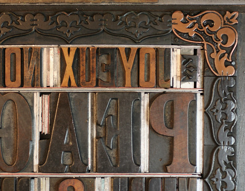
In October, I was fortunate to acquire a large collection of wood type that had previously been buried in the attic of a print shop that served all the printing needs of the small town in which I grew up. Some 70 faces strong, it included some very fine specimens of both elaborate and hard working fonts that have seen a great deal of wear, care and repair, as well as fantastic borders and ornamental pieces.
I was able to ship a large portion of the collection back to Starshaped in Chicago so that we could begin to use it as soon as possible. The first piece I wanted to create was a holiday print that incorporated a lot of text, since this would give me the opportunity to use many of the new faces, as well as at least one of the borders. Given the maximum sheet size our proof press can handle (approx. 14x18"), it became apparently quickly that setting up one forme (the type/ornaments/borders and necessary set up pieces) just wouldn't do.
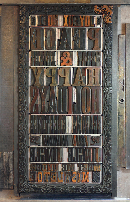
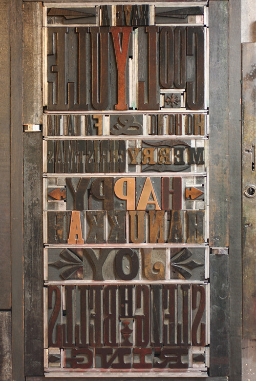
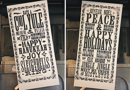
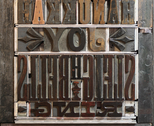
I set up two separate formes (above) to use as much of the most interesting type as possible and considered printing two separate posters (below).
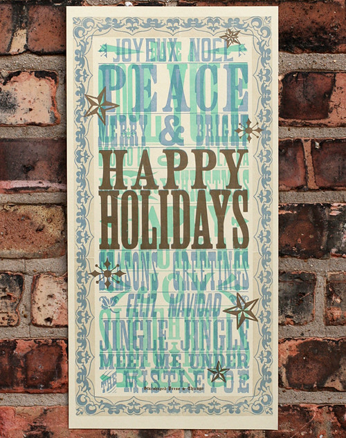
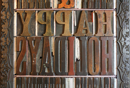
Then I thought it might be fun to run them both in different colors on one piece of paper to see how the type would interact and create new forms in the print. I added some prominence to the border by printing rectangular linoleum blocks behind it. After printing the two formes, I still needed something to act like a focal point and decided the large HAPPY HOLIDAYS would definitely do that.
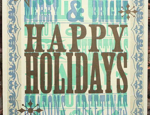
I added some of the star and snowflake-esque ornaments and printed them in gold. Overall, I was quite happy with the look of the poster and tried a few different paper options to get different effects (below).
A few interesting tidbits...
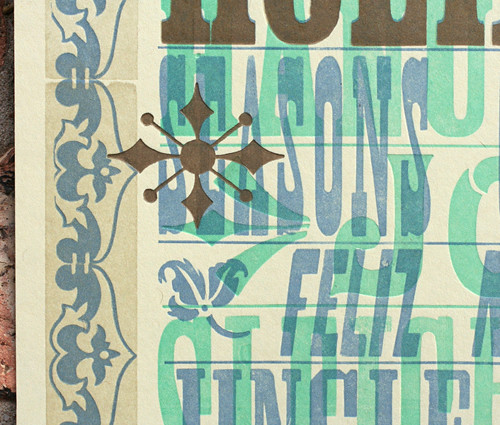
-One of the corner border pieces was replaced at some point in its life; it's made of copper instead of wood, which was a common way to replace missing or damaged pieces.
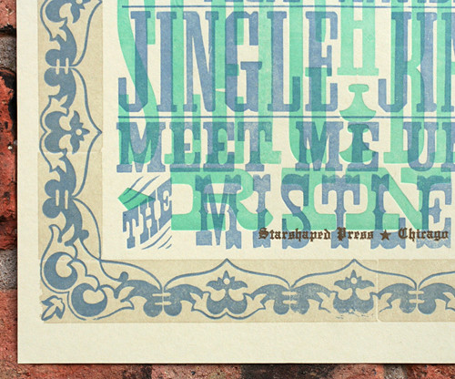
-'Feliz Navidad' uses type that is actually cut on a diagonal instead of a straight rectangular block. It even came with it's own spacing to make it fit with whatever else prints alongside it.
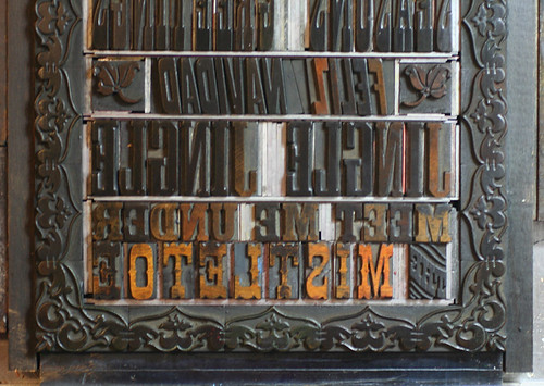
-Necessity is the mother of invention; there is no 'H' in the typeface used for 'sleighbells', hence the improvised smaller H with ornaments below it.
-Much of the type was already mortised, meaning that the negative spaces were cut away so that it could fit more closely with the type next to it. This is most obvious (and useful) in 'HOLIDAYS' with the A and Y.
 starshaped press